The Flattening Fail: Why You Need a Tattoo Font Generator for 3D Bodies
Let’s talk about the “Instagram vs. Reality” of the tattoo world. You see a beautiful, flowing script on a flat screen, and it looks perfect. But then, you get it tattooed on your forearm, and suddenly, every time you twist your wrist to check your watch, your meaningful quote looks like a pile of tangled spaghetti.
This happens because most people design their tattoos in a two-dimensional headspace. They use standard font tools designed for flat paper or digital banners. But you, my friend, are not a piece of paper. You are a complex, three-dimensional masterpiece of muscles, tendons, and curves. When you move, your skin moves. When you age, your skin changes.
This is exactly why a dedicated Tattoo Font generator is the most important tool in your pre-ink arsenal. At refont, we didn’t just build a “typewriter” for the web. We built a tool that respects the anatomy of the human canvas. Our AI understands that a tattoo isn’t a static image; it’s a living part of your body. By using a professional Tattoo Font generator, you ensure that your design maintains its integrity whether you are standing still or in full motion.
Matching Style to Skin: Using the Tattoo Font Generator Across Different Placements
Every body part has its own “topography,” and certain fonts work better in certain “neighborhoods.” Here is how to use our tool to match the right style to the right skin.
The Forearm and Calf: The Linear Landscapes
The forearm is the most popular “billboard” for script tattoos. Because these muscle groups are long and lean, they benefit from “Linear Scripts”—fonts that have a horizontal flow. When using the Tattoo Font generator for these areas, consider a slanted Chicano or a slanted Calligraphy style. The slant mimics the natural diagonal line of the forearm muscles, making the tattoo look like it’s following the body’s natural rhythm.
The Collarbone and Ribs: Mastering the Curves
The collarbone and ribs are high-pain but high-reward areas. They are organic and curved. A rigid, straight-line font here can look harsh and out of place. Instead, use our generator to find styles with “extended flourishes.” These are the decorative tails that whip off the ends of letters. You can use these flourishes to “cradle” the bone structure, turning a simple word into a piece of jewelry that sits perfectly on your frame.
The Wrist and Finger: Navigating High-Movement Zones
Finger and wrist tattoos are incredibly trendy, but they are also “danger zones” for font design. The skin here is thin, moves constantly, and is prone to fading. For these areas, our Tattoo Font generator recommends “Minimalist Sans-Serif” or very clean “Handwritten” styles. The secret here is simplicity. If the font is too complex, the movement of the joints will make it unreadable within months.
The Back and Chest: Architectural Impact
If you are going big, go bold. The back and chest are your largest canvases. This is where “Blackletter” and “Gothic” styles shine. These fonts are architectural and heavy. Using our Tattoo Font generator for a chest piece allows you to balance the weight of the letters across the sternum, ensuring that the “negative space” (the skin between the letters) is just as beautiful as the ink itself.
Fighting the “Blur”: Technical Secrets of Our Tattoo Font Generator
One of the most common questions we get is: “Will my script tattoo turn into a black blob in ten years?” The honest answer is: if you use a standard computer font, probably. But if you use our Tattoo Font generator, we’ve already built in the solution.
Ink Spread (Blowout) Prevention
In the tattoo world, we call it “migration.” Over time, the ink particles in your skin naturally spread out. This is why “Kerning”—the technical term for the space between letters—is so critical. If your letters are too close, they will eventually touch and blur. Our AI-driven generator uses “Safety Spacing” logic. It automatically suggests a kerning distance that accounts for twenty years of aging. We make sure your “e” stays an “e” and doesn’t become a “o.”
The Aging Factor
Different parts of the body age differently. Sun-exposed areas like the hands and neck fade faster. Our Tattoo Font generator allows you to adjust the “Weight” of the lines. For areas prone to fading, you might choose a slightly bolder weight to ensure the tattoo stays visible. For protected areas like the ribs, you can go for that ultra-fine-line look that everyone loves.
Contrast and Clarity
A tattoo artist is only as good as the stencil they follow. If you bring your artist a blurry, low-contrast image, you are making their job ten times harder. Our generator outputs high-definition, high-contrast black and white images. This ensures that when the stencil is applied to your skin, the lines are definitive and sharp. No guesswork, no “oops” moments—just precision.
3 Simple Steps to Perfect Your Placement with the Tattoo Font Generator
Designing a professional-grade tattoo doesn’t have to be complicated. Here is how to do it in three steps:
Step 1: Choose Your Vibe (Aesthetic Selection)
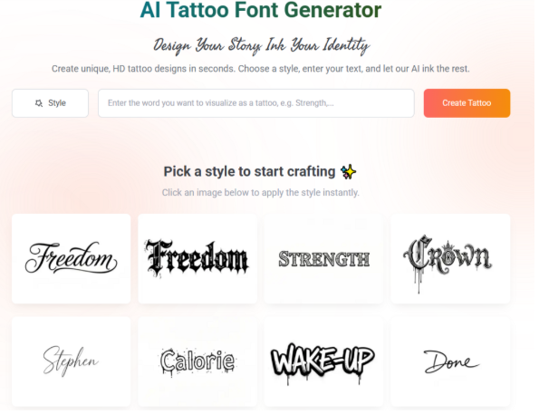
Start by browsing our library. Think about the “vibe” of the body part you are tattooing. Is it a delicate area (Script) or a bold area (Blackletter)? Our Tattoo Font generator categorizes thousands of styles to help you find the perfect match for your personality and your placement.
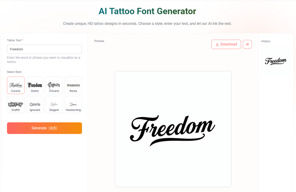
Step 2: Visualize Your Story (Input Your Text)
Type in your quote or name. This is where you play with the “physics” of the design. Use our sliders to adjust the slant, the weight, and the flourishes. Watch how the AI balances the word instantly. If you’re tattooing a curved area like the ribs, pay close attention to how the flourishes can be used to follow your bone structure.
Step 3: Get the Blueprint (High-Definition Export)
Once it looks perfect, download the HD image. This is your professional blueprint. Take it to your artist, and they will see a design that is already optimized for the skin. It’s the ultimate way to ensure that what you see on the screen is exactly what you get on your body.
Professional Tips: What Your Tattoo Artist Wishes You Knew About Font Choice
As an SEO team, we talk to a lot of tattoo artists. Here is the “inside scoop” they want you to know:
- Smaller isn’t always better: Many people want tiny script, but if it’s too small, it won’t last. Use the generator to find a balance between “dainty” and “durable.”
- Trust the negative space: The skin between the letters is what makes the letters readable. Don’t crowd your design.
- The “Twist” Test: If you’re tattooing an arm or leg, remember that the font will twist as you move. A professional Tattoo Font generator helps you pick a font that looks good from multiple angles.
Conclusion: Respect the Canvas with the Best Tattoo Font Generator
Your body is not a flat sheet of paper, so stop treating it like one. When you choose a font for a permanent piece of body art, you are making a decision that involves art, biology, and physics.
By using the refont Tattoo Font Generator, you are choosing a tool that was built specifically for the “Real Human Canvas.” You are ensuring that your placement is precise, your style is authentic, and your design is built to stand the test of time. Don’t leave your skin to chance. Respect the canvas, respect the craft, and design your legacy with precision.
Ready to see how your design fits? Start perfecting your placement with the refont Tattoo Font Generator today.